Minimalist Desktop Wallpaper: How to Choose One That Actually Calms Your Screen
Minimal isn't just 'less stuff'. Seven practical principles — negative space, value contrast, color temperature, texture — for picking a desktop wallpaper that stays calm all day.
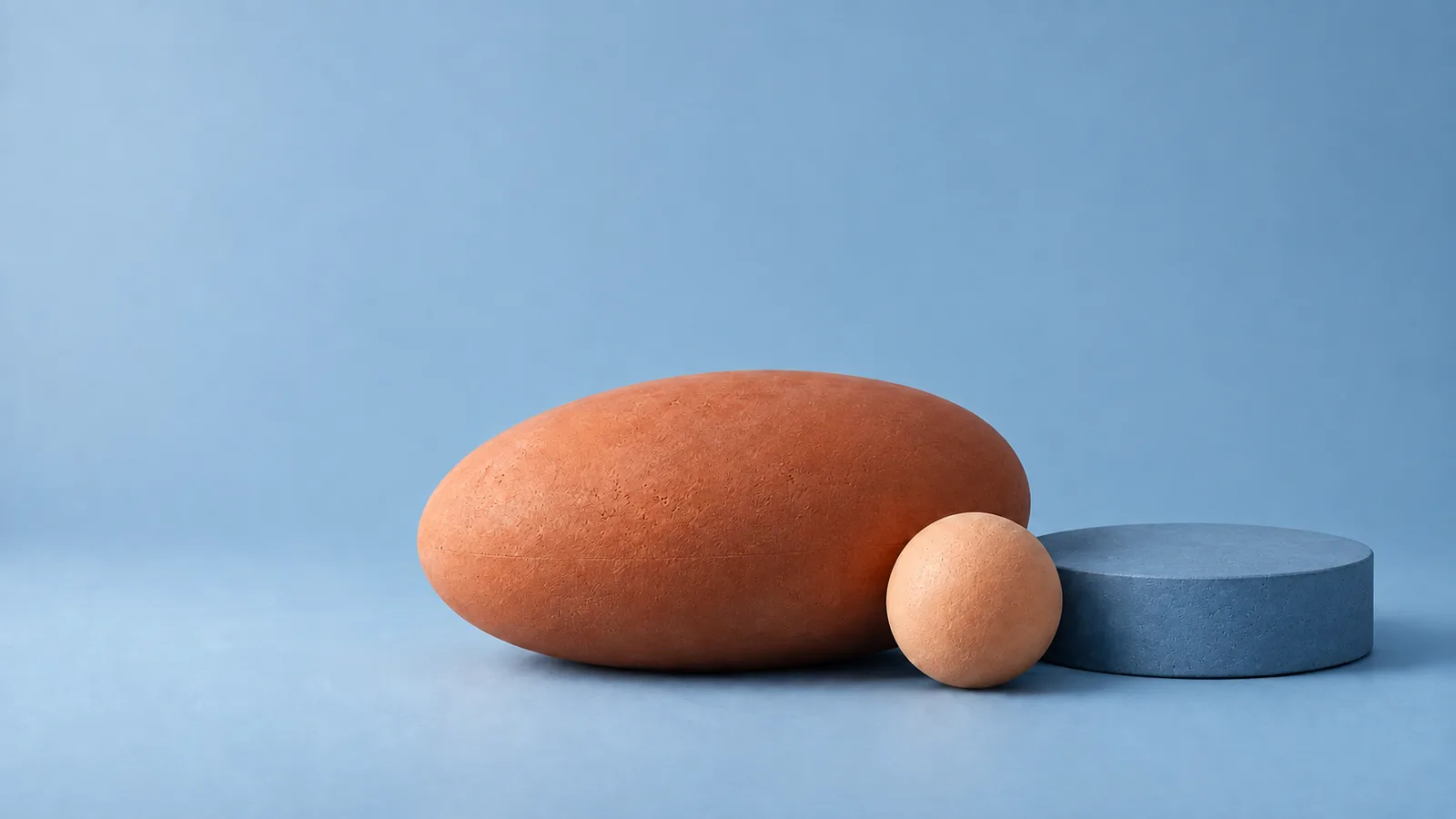
You probably look at your desktop wallpaper hundreds of times a day — in the gaps between windows, when you switch apps, when you open the laptop. A busy image adds a little visual noise every one of those times. A good minimalist wallpaper does the opposite: it’s pleasant at a glance and invisible while you work.
But “minimalist” is often misunderstood as “a flat color” or “a tiny logo in the middle”. Here’s what actually makes a wallpaper calm, and how to judge one before you set it.
1. Negative space where your icons live
The most practical test: where will things sit on top of it?
On a Mac, the menu bar runs along the top, the Dock usually sits at the bottom, and desktop icons line up along the right edge by default. Desktop widgets can go anywhere you place them. A wallpaper whose main subject sits exactly under your icons forces you to read text on top of detail.
Look for compositions with a large, low-detail zone — a soft gradient, an even surface, plain sky — in the areas you actually use. Shapes placed left of center or low in the frame tend to work well with macOS defaults.
2. Low value contrast beats low color
Calm isn’t about having few colors; it’s about small differences in lightness. An image of deep navy next to pale cream is high-contrast even with just two colors, and the eye keeps getting pulled to the edge between them.
Squint at a wallpaper (or blur it in your head). If it still reads as several strong light and dark patches, it will feel busy. If it melts into a gentle range of mid-tones, it will feel quiet. Muted palettes — chalk, sand, sage, dusty blue, warm gray — make this easier because they live in a narrow band of lightness.
3. Texture instead of detail
Completely flat backgrounds can look sterile, especially on large, high-resolution screens. Fine texture — paper grain, matte plaster, soft fabric, film-like noise — gives the eye something to rest on without asking for attention.
That’s the difference between texture and detail: texture is uniform and low-contrast, detail is specific and wants to be looked at. Keep the first, avoid the second.
4. One idea per image
A calm wallpaper usually has a single subject or gesture: one fold, one horizon, one arrangement of shapes. Multiple focal points compete with each other — and with your windows. If you can’t describe the image in one short phrase, it’s probably doing too much for a background.
5. Mind the color temperature
Your screen’s color shifts across the day if you use Night Shift or True Tone, and your room’s light changes too. Warm neutrals (ivory, sand, clay) tend to stay pleasant in the evening. Cool tones (blue-gray, sage) feel crisp in daylight. Very saturated colors are the least forgiving: they can look vibrant at noon and harsh at night.
If you switch between light and dark mode, consider two wallpapers in the same style — a lighter one for day, a deeper one for evening. Or use a mid-tone image that works with both.
6. Avoid text, logos and faces
Our brains are wired to read text and look at faces, automatically and every time. Even a small quote or face in the corner of a wallpaper will catch your eye again and again. For a calm workspace, keep them out of the background.
7. Resolution is part of calm
Soft blur from an undersized image, JPEG blocks in a gradient, or a crop that cuts a shape in half — these small flaws are visual noise too. Use a file that matches your display’s native resolution and aspect ratio. Our Mac resolution guide lists the exact sizes.
A quick test before you commit
Set the wallpaper, then live with it for a normal work session:
- Open your usual apps and check the gaps between windows. Is anything distracting peeking through?
- Look at your desktop icons and widgets. Are the labels easy to read without effort?
- Check it in the evening. Does it still feel comfortable?
If the answer is yes all three times, you’ve found a good one.
Where Quiet Forms comes from
We designed Quiet Forms around exactly these principles: tactile paper and plaster shapes, a narrow range of soft tones, one simple gesture per image and broad empty areas for your icons. If you want a set of wallpapers that look good together in rotation, it’s a good place to start.
Keep reading
Get the next drop first
One short email when a new collection is released. Early access, occasional free wallpapers, no spam.